| ||||
When is enough enough?
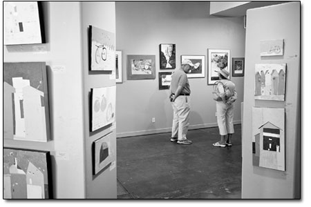
by Jules Masterjohn It seems to be human to think more is better. When it comes to governments signing the Kyoto Protocol, miles per gallon or solar panels, this impulse is beneficial. It appears, however, that this same desire for more is one of the causes of our predicament of dwindling resources on a limited planet. Perhaps with so much striving, we loose our ability to discern when enough is simply enough. These musings could be the basis for a rousing philosophical discussion. In fact, the belief that “more is better” can be seen in the Durango Arts Center’s current exhibit “5/4 Time.” Though the show displays many accomplished works, the quantity of sculpture and painting in the gallery is overwhelming. Few pieces have room to breath, and the viewing experience is compromised. With close to 70 works to look at, the challenge is to “see” each piece. In the case of “5/4 Time,” more art does not make for a better show. The playful mixed-media paintings by Tess Corrinne Jordan demonstrate the painter’s interest in variations on a theme. Bicycles and houses are her favorite subject, portrayed in abstract and simplified form. Painted using a direct and childlike style, Jordon’s images investigate the many possibilities in arranging shapes and colors on a picture plane. Predominant in her paintings are line drawings within fields of designer colors, like turquoise, blues and avocado greens. Generally cool in flavor, the compositions are spotted, dotted and dashed with smaller areas of reds, oranges and yellows. One of her larger canvases, “Trevor’s Bike,” offers the most realized of Jordon’s many works. The loosely drawn outline of a bicycle appears out of focus in some areas due to a semi-translucent paint applied over the painting’s surface. In other areas, the outline is drawn directly on top of the paint. In a few places, the bike’s anatomy is so dominant that it rises up through the over painting. The overall effect is a bicycle wafting in and out of view. This layering technique is used in many of her mixed-media works, and in some, she scratches through the paint surface, revealing the under painting beneath. Layering is used as a metaphor for Jordan’s experience of life. She writes in her artist statement, “I see the world in shapes and colors – altered by the influence of layers of memory.” There is no suggestion of realistic, dimensional space in her paintings. Instead, depth is defined by the optics of color and occasional overlapping shapes. A flattened sense of space exists in these personal and imaginary places, worlds inhabited by her memories of home and other intimacies.
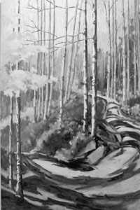
Jordan clearly enjoys painting. This is evidenced in her spontaneous approach and free handling of the materials. The paint is lusciously applied, yet I wonder why she chooses to use a matte paint: the dry surface seems to work against the juiciness of her painterly approach. There are delicious little treats hovering just under the surface of her paintings, awaiting anyone with an inquiring and determined eye. Wading through her numerous and similar paintings is worth the effort. Coni Grant employs a representational style in her oil paintings of dense forests. She convincingly conveys the sense of space within the forest through her steady design skills. The coloration, however, departs for the naturalistic. Instead, highly saturated, complimentary colors in oranges and blue/violets vibrate each tree and the forest as a whole, into life. As in the forest, a strong verticality is present in her works. These paintings pull the viewer in with their optically attractive colors and, while at the same time, keeping one at a distance, separated from the forest itself. The vertical lines of the tree trunks span the entire height of each picture and act like bars – there is no entering these forest scenes. My perception runs contrary to Grant’s intentions. In her artist statement she writes, “Designed intentionally to give the viewer a sense of being on the inside, they become a meditation on, and in, the landscape.” Intellectually, I understand her intent, yet my body is not convinced. Looking into the forest, as if through a window, I am denied access. In the painting “Pony Trail,” on the other hand, Grant has opened up the brilliantly colored painting’s interior by illustrating a pathway into the forest. Lavender and periwinkle accent the hot oranges and yellows with bright white trees defining the edges of the forest trail. The husband and wife team of Henry Woolbert and Kathy Park have collaborated on a series of wall sculptures that take the form of masks. Obviously inspired by tribal art, nearly all of the 16 pieces show simplified and abstracted faces. Here, as with Jordan’s work, too many pieces are presented. Well designed and showing skill with paper maché and gel pens, the mixed-media works hold firmly to formal elements themed around straightforward ideas. Transcending materials and technique, “Brush Spirit” incorporates found objects that imbue the sculpture with a liveliness that is absent from many of their works. Perhaps due to the paintbrushes used as the mask’s headdress and facial ornamentation, these well-worn tools animate the sculpture with a wisdom and presence that is both powerful and whimsical. Dwight Lawing isn’t trying to make grand artistic statements with his watercolor paintings, he is simply implementing “a series of tricks” that anyone can learn. His love of the watercolor medium can be seen in the painting, “New Mexico,” which shows a fresh look at a place painted and photographed many times, the region’s ubiquitous red rock spires. This painting, however, rises above the usual mundane depictions of this dynamic landscape and captures the essential authority of a towering rock formation. • “5/4 Time” is on display through May 30 at the Durango Arts Center, 802 E. Second Ave. Gallery hours are 10 a.m.-5 p.m., Tuesday –Saturday.
|


