| ||
High tech, high touch
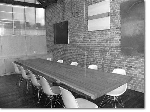
by Jules Masterjohn As I walked up the newly painted stairwell of the century-old Main Avenue building, I heard mumbled voices of the partying crowd above. The smell of fresh paint sent me time traveling, back 20 years to a similar ascent up to a SoHo loft for an art showing. One could tell from the Big Apple stairwell, splattered with Pollock-esque drips of brightly colored paint, that creative types resided above. Déjà vu is so fleeting: Moments after flashing back, my senses were tugged into the present by an awareness of softly colored lights from above. The glowing sensation was emanating from five different colored florescent tubes mounted on the ceiling. Firmly back in the here-and-now, I reached the end of my climb and entered the Russell Engineering office for a gathering to celebrate the newly renovated space. The first thing I noticed inside, other than lots of folks enjoying revelry, was the reception desk made of rolled steel, concrete, rebar and wood. Behind it stood an earthen wall reaching toward the high ceiling, rich with cracked textures. In contrast to the high-tech look of the desk, with its industrial materials and machined design, the earthy color and softness of the clay surface revealed the subtle impressions of the hands that formed it. These handprints belong to Jeff Madeen and Matt Clark, two primary partners of Analog Architecture and Design, and Joan Levine Russell – all artists and collaborators on this renovation project. The trio came together when Levine Russell and her husband, Mike Russell, decided to hire Madeen and Clark to design their new office space. The Russells had just bought the 100-year old second story of 934 Main Ave. as the offices for their growing civil engineering firm. Infrastructure improvements and historic restoration included a steel I-beam running the building’s length and the exposure of two-story, arched windows at the front. The windows, the I-beam and the exposed brick walls were the primary attractions for their purchase. The Russells looked to the Analog design team to create a cutting-edge environment, a design style that has been described as “techno-primitivism.” The marriage of these two disparate ideas and stylistic modes represents the core of the Analog team’s philosophy. “We are against anything ersatz,” Madeen told me, meaning no substitutes for the real thing. Using materials honestly is a foundational principle to which the design duo aspires. Their values place high importance, not only on the “seeing” of the materials but also on showing the construction processes used in their projects. They believe that these two factors stimulate “a sensual experience” with the materials that cause one to “feel differently” when entering a space. Working closely on the renovation with the Russells was both necessary and immensely satisfying for Madeen and Clark. The materials used in the offices, for example, are those that Mike Russell knows well – earth, concrete and steel. As a civil engineer, his work is based on the successful integration of these elements. Considerable input from artist Levine Russell helped the designers to narrow in on the materials to be used. “Being an artist herself, Joan has a strong feeling for material palettes and understands the way hard and soft and smooth and rough work together,” said Clark. This office space is sophisticated and elegant with a clever use of light. Galvanized sheet metal covers the ceilings throughout the space and reflects light from the fluorescent fixtures inside as well as sunlight from outside. Many internal walls are constructed with translucent polycarbonate sheeting, the same material used in greenhouse walls, to allow light from the large windows in front to illuminate the enclosed center rooms. The metal wall studs that hold the sheets in place can be seen through the polycarbonate, exposing the walls’ infrastructure. In the conference room, a cross-section of a large red elm lies horizontally, acting as the conference table. Suspended at one end by a metal cable from the ceiling and suspended on the other by a concrete pedestal, this display of physical tension is the room’s main feature, a sculpture made for everyday use. Touching this table is sensual: The top is finely sanded and the edges have been stripped, leaving them caressingly soft. Juxtaposed with the warmth of the wood is the steel and glass sliding door to the conference room’s entrance. A door within a door, a sliding glass panel moves within the larger rolling steel door. Two sets of skateboarding wheels mounted on the floor guide the steel door across the entryway into a closed position, allowing the sliding glass door to serve as the room’s portal. As one tours the office, the “” aesthetic of the Analog design team and collaborator Levine Russell, is clear. Contemporary light fixtures hang above a row of old theater seats, which were abandoned in the building and resurrected with new upholstery for use in the waiting area. On the wall above the seats, an original Robert Rauschenberg print is on display. Throughout the office many elements, raw and refined, invite the eye and hand. The unifying features in this space are the terra cotta brick walls and the exposed wooden roof trusses. Traversing below the high metal ceiling, they offer a richness of texture, line and form that contrasts the old with the new, making a walk through this space an exquisitely elemental experience. If you would like to see the Russell Engineering offices, contact Madeen or Clark at Analog Architecture and Design, 382-9821, for a personal tour. •
|


