|
Draft design guidelines will guide future commercial
growth
by Missy Votel
 |
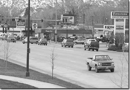
| Scenes like this one, along
North Main, could get a facelift under new commercial corridor
design guidelines being proposed by the city./Photo by Todd
Newcomer. |
As Durango surges ahead into a new era of growth, city planners
are attempting to walk the fine line between blight and bloom.
The Durango Planning Department is in the process of compiling
commercial corridor design guidelines that will apply to some
of the city’s most traveled thoroughfares. The guidelines
will provide a vision for how the city would like to see new commercial
development and urban renewal occur.
The city has designated six distinct areas of concern: U.S. Highway
550/160, from Camino del Rio to Farmington Hill; Highway 550 from
Farmington Hill to Elmore’s Corner; Highway 160, from Camino
del Rio to the city’s western limits; Highway 3; College
Drive and Eighth Avenue; and North Main Avenue, from the Main
Street Bridge to the northern city limits.
“What we are trying to do is envision, 15, 20, 30 years
from now, what we want these corridors to look like,” said
Keith Walzak, the Planning Department’s special projects
manager. “It’s about creating better quality; that’s
what the purpose is.”
He also said the purpose is to clean up a lot of haphazard development
that took place 20 to 30 years ago, before any codes were in place.
“There’s a lot of ’70s and ’80s stuff,
and we didn’t know what we were doing back then,”
he said.
The commercial corridor guidelines came about as the result of
similar guidelines that were put in place downtown in the early
’80s. “People think that it’s really worked
well for downtown,” he said.
The latest version of the guidelines is the second draft. The
first one was done by Winter and Co., the firm that also did the
downtown plan in the ’80s. The commercial corridor guidelines
were based upon comments from public meetings, interest groups
and focus groups as well as Design Review Board work sessions.
Walzak said the guidelines will come into play when developers
in one of the six areas come in front of the city’s Design
Review Board for approval. However, he noted there will be no
hard and fast rules. The guidelines will merely suggest a framework.
“Really, the design guidelines are to help architects,
builders and designers understand what we’re trying to achieve,”
Walzak said.
While each sector has its own characteristics, overall the city
is trying to mimic the “livable” qualities found within
its historic core. These include pedestrian and bicycle friendly
developments; buildings that incorporate local materials, such
as stone and brick; common design elements that tie neighboring
buildings together; buildings that emphasize accessibility and
are of a “human scale”; and plans that are not dominated
by parking.
“Typically, what you see a lot of right now is a building
on the back of a lot with parking in front,” said Walzak.
“But we might want to advocate parking in the back with
the building out front. That’s the kind of stuff we’re
trying to emphasize.”
The city also will be developing guidelines with an eye toward
the natural environment. Such design elements will strive for
connections to trails and paths; native vegetation buffers between
sidewalks and traffic; street medians; and buildings that blend
with the landscape.
Another area where the city would like to make improvements is
with signage, particularly along the North Main corridor.
“Signage seems to be getting a lot of attention,”
Walzak said. “We would like to see some reduction in the
visual clutter by finding the right balance.”
Specifically, he pointed to some fast food restaurants that,
in essence, use their entire building as an advertisement, including
corporate logo colors.
“Basically, the entire architecture is a sign,” he
said. “We’re trying to eliminate that.”
However, Walzak pointed out this does not mean all color will
be done away with.
“If everything’s a muted tone, it looks boring after
a while,” he said. In fact, he said a recent trip to San
Diego proved that color can give an area character.
“We’ll need to talk about the impacts of color,”
he said.
Likewise, he noted that the goal of the guidelines is not to
create a bland monoscape of identical structures.
“The more interesting towns are the ones with some funky
touches,” he said. “We don’t want the plastic,
fake mountain town that looks like every other mountain town.”
Walzak expects the final version of the guidelines to be ready
in late March, at which time they will go in front of the Durango
Planning Commission and then the City Council. He expects final
approval some time in April, at which time the guidelines will
go into effect.
And while this is good news for undeveloped corridors, it will
have little immediate effect on areas that are already heavily
developed, such as North Main and Camino del Rio. He said he expects
existing businesses to be grandfathered in, thus granted immunity
from the new guidelines. However, each new business that goes
in will be expected to comply. He admits things won’t change
overnight, but eventually they will take place.
“It’s a tough challenge,” he said. “But
that’s the goal: to get cool things going. It’ll happen,
slowly but surely.”
|

